
Next Up, Let's review Named Slots in VueJS with the help of an example. We covered a lesson on slots in VueJS in the last section. slots help us to take the defined content inside the HTML markup of the component and put them in wherever specified in the template. The problem is it only works for a single default slot.
But what if we want to create more complex markup, where we are looking to accept different content from the user which we have to place at different locations.
Let's understand this with the help of an example.
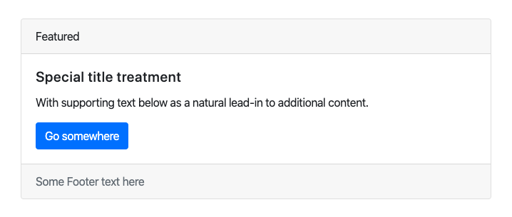
We are looking to convert the Bootstrap Card markup to a Vue Component. Here is generic HTML markup of a Bootstrap card.
<div class="card">
  <div class="card-header">
    Featured
  </div>
  <div class="card-body">
    <h5 class="card-title">Special title treatment</h5>
    <p class="card-text">With supporting text below as a natural lead-in to additional content.</p>
    <a href="#" class="btn btn-primary">Go somewhere</a>
  </div>
   <div class="card-footer text-muted">
        Some Footer text here
    </div>
</div>
And this gives out a generic card styling in the output.
We want the user to be able to specify content to be slotted in the card header, card body, and card footer.
Named Slots in VueJS
Let's approach it using named slots in VueJS.
Here is the Vue Component code, we have defined the Bootstrap Card markup in our HTML and we have replaced the text with slot element.
Vue.component('bootstrap-card',{
    template: `<div class="card">
            <div class="card-header">
                <slot name="header"></slot>
            </div>
            <div class="card-body">
                <slot></slot>
            </div>
            <div class="card-footer text-muted">
                <slot name="footer">Default Footer Content</slot>
            </div>
        </div>`,
});

let app = new Vue({
    el : '#app'
});
Notice that the slots are named. The name of the first slot is header, The second one is without a slot that means this is the default slot, the name of the third slot is the footer.
Now let's see how we can pas content to different slots from our HTML markup.
<bootstrap-card>
    <template v-slot:header>Header Text</template>
        <h5 class="card-title">Special title treatment</h5>
        <p class="card-text">With supporting text below as a natural lead-in to additional content.</p>
        <a href="#" class="btn btn-primary">Go somewhere</a>
    <template v-slot:footer>Footer Content</template>
</bootstrap-card>
We have defined the first template with v-slot:header directive inside the component markup. This denotes that text that should go into the header slot. There is a similar template with v-slot:footer directive which denotes the content that should go into footer slot.
Also, there is HTML content defined without any directive which gives an indication to VueJS to put it inside the default slot.
Fallback Content
VueJS slots also have provision for fallback content is no content is supplied to the slot.
Notice our VueJS component for footer slot we have defined a fallback content.
<slot name="footer">Default Footer Content</slot>If no content is supplied to the footer slot from the markup, then the slot will be replaced with the default content provided.
That's all about Named Slots in VueJS.